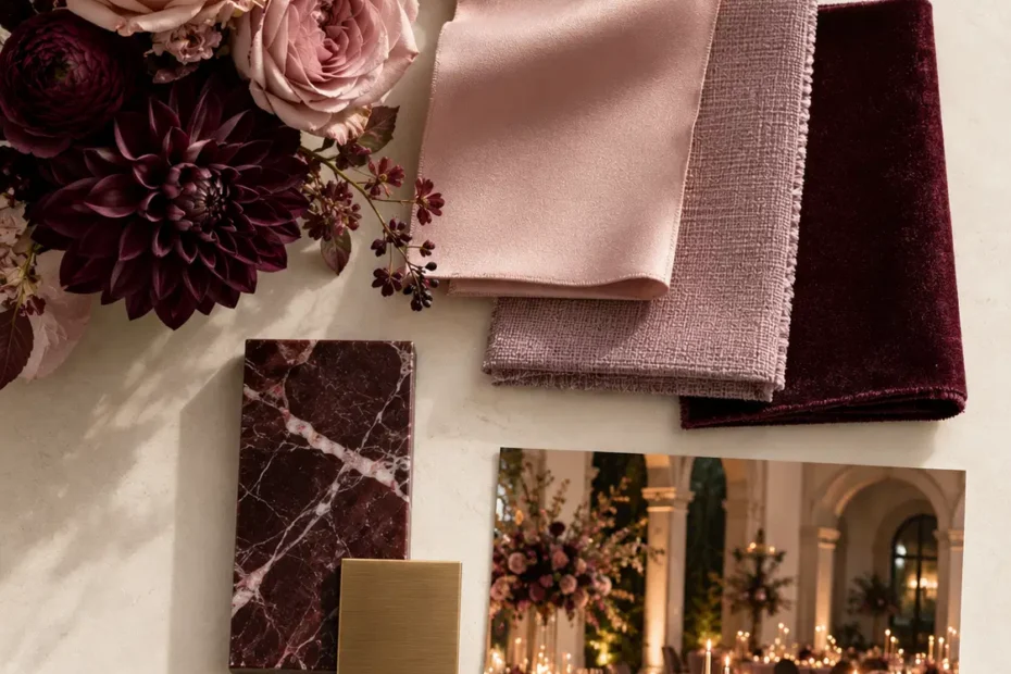
Romance, With Depth: A Wedding Design That Embraces Richer Color
Dusty rose. Mauve. Plum. Wine. Romance with a little more personality.
Romance has a reputation.
Soft pink flowers. Blush linens. Candlelight. Maybe a little lace somewhere, because apparently romance comes with a standard decorating kit.
And while there's absolutely nothing wrong with a beautiful blush wedding, romance has considerably more range than we've been giving it credit for.
It can be dramatic without being dark. Feminine without being delicate. Rich without being overwhelming.
And sometimes, it needs a little depth.
Welcome to Romance, With Depth, the second concept in The Wedding Design Edit by A Very Lovely Wedding.
This time, we're exploring what happens when soft romantic tones meet deeper, moodier shades—and why the contrast between them is what makes the design interesting.
The Inspiration: Romance Has Range
Think of the difference between a whisper and a conversation you never want to end.
Both can be intimate. But they create entirely different experiences.
That's how we approach romantic wedding design.
Rather than relying on one soft shade repeated throughout the room, we build a visual story through variations in color, texture, and intensity.
Dusty rose brings softness. Mauve introduces sophistication. Plum adds richness. Wine creates depth.
Together, they feel romantic, but not predictable.
The beauty is in how these colors interact.
A deep plum arrangement against a dusty rose linen creates a completely different impression than the same flowers against a dark tablecloth.
Neither is necessarily better.
But each makes a different statement.
And understanding that difference is what turns a collection of pretty colors into an intentional design.
The Palette: Softness Meets Saturation
Our palette for Romance, With Depth moves gradually from muted romance to rich, dramatic color.
Dusty Rose — #DAB9B5
Soft, warm, and quietly romantic. This is our lightest tone, bringing balance and breathing room to the richer shades.
Mauve — #AF8498
A sophisticated bridge between pink and purple. Mauve adds dimension without demanding attention.
Plum — #704258
Deep, elegant, and expressive. Plum introduces the richness that gives this collection its personality.
Wine — #401F30
Our darkest shade. Intimate, dramatic, and beautifully grounding.
The secret isn't using all four colors equally.
In fact, please don't.
A strong palette needs hierarchy.
One color establishes the atmosphere. Another supports it. A deeper shade introduces contrast. And the darkest tone provides definition.
For this concept, dusty rose and mauve can create the foundation, while plum and wine add visual depth through florals, textiles, and carefully selected details.
That balance allows the design to feel layered rather than heavy.

The Application: A Reception That Feels Like Romance
Imagine walking into a reception where the colors seem to unfold as you move through the room.
Soft dusty rose linens establish warmth. Mauve napkins add a subtle tonal shift. Deep plum and wine-colored florals create striking focal points.
Candlelight moves across glassware and polished surfaces, introducing a softness that balances the darker tones.
The room feels intimate without being enclosed. Dramatic without being theatrical.
And romantic without a single oversized heart in sight.
Florals are particularly important in this design.
Garden roses, ranunculus, dahlias, and delicate seasonal blooms can create a beautiful progression from muted pink to deep burgundy.
But rather than placing every flower variety and every color into every arrangement, we would create intentional variation.
Some tables might feature predominantly dusty rose and mauve flowers with a few darker accents. Others could introduce more plum and wine for contrast.
The arrangements still belong to the same design, but they aren't carbon copies of one another.
The result feels curated, organic, and visually interesting.
Because consistency doesn't require repetition.

The Wedding Party: Coordinated, Not Identical
This is where the palette becomes especially beautiful.
Imagine bridesmaids in a thoughtfully selected combination of dusty rose, mauve, plum, and wine gowns.
Different shades. Complementary fabrics. Silhouettes chosen to suit the people wearing them.
Not four colors assigned randomly because they happen to be on the same Pinterest board.
There's a difference.
The lighter shades create softness, while the deeper colors add definition. When photographed together, the variation gives the group a beautiful sense of movement and dimension.
For the groom and groomsmen, classic black or deep charcoal tailoring provides a sophisticated contrast.
A subtle wine-colored boutonniere or pocket square can connect the attire to the larger design without making the entire wedding party look overly coordinated.
Bouquets carry the floral story through the ceremony, creating a natural connection between the wedding party, the setting, and the reception.
The goal is harmony.
Not matching for the sake of matching.

The Design Principle: Contrast Creates Emotion
Color does more than make a room look beautiful.
It influences how a space feels.
Lighter tones often create openness and softness. Deeper tones can introduce intimacy, warmth, and drama.
When we combine them intentionally, we can shape the emotional atmosphere of a celebration.
But there's an important distinction between creating depth and making everything dark.
If every linen, flower, chair, backdrop, and accessory is competing in the deepest shade of wine, we've lost the contrast that made the palette interesting in the first place.
The darker colors need lighter moments around them.
And the lighter colors become more compelling because the darker ones exist.
It's a relationship.
Much like good design itself, neither side needs to overpower the other.
Is Romance, With Depth Your Wedding Style?
Maybe you love romantic weddings but don't want yours to feel overly sweet.
Perhaps you're drawn to rich florals, candlelit receptions, and colors that feel elegant without being overly traditional.
Or maybe you've always loved blush and burgundy but haven't quite figured out how to bring them together without making the room feel heavy.
This collection offers a starting point.
It works beautifully for couples who appreciate softness but aren't afraid of contrast.
And like every design concept we share, it's meant to inspire—not dictate.
You might prefer more dusty rose and less wine. You might love the deeper tones but want to introduce a neutral linen. You might choose to carry the drama through the florals while keeping everything else beautifully understated.
The right balance depends on the atmosphere you want to create.
Not on a formula.
At A Very Lovely Wedding, we believe a wedding should feel thoughtfully designed without losing the personalities of the people being celebrated.
Romance doesn't have to be pale.
It doesn't have to be predictable.
And it certainly doesn't have to apologize for having a little drama.
Thoughtfully planned. Beautifully personal.
A Very Lovely Wedding
The Wedding Design Edit — Vol. 01
Romance, With Depth is the second of three wedding design concepts exploring how color, texture, and intentional choices create distinct wedding atmospheres.